The viewer interface
The two viewer layouts — full sidebar and the minimized strip embeds default to — the panels in each, and how selection behaves when someone clicks the model.
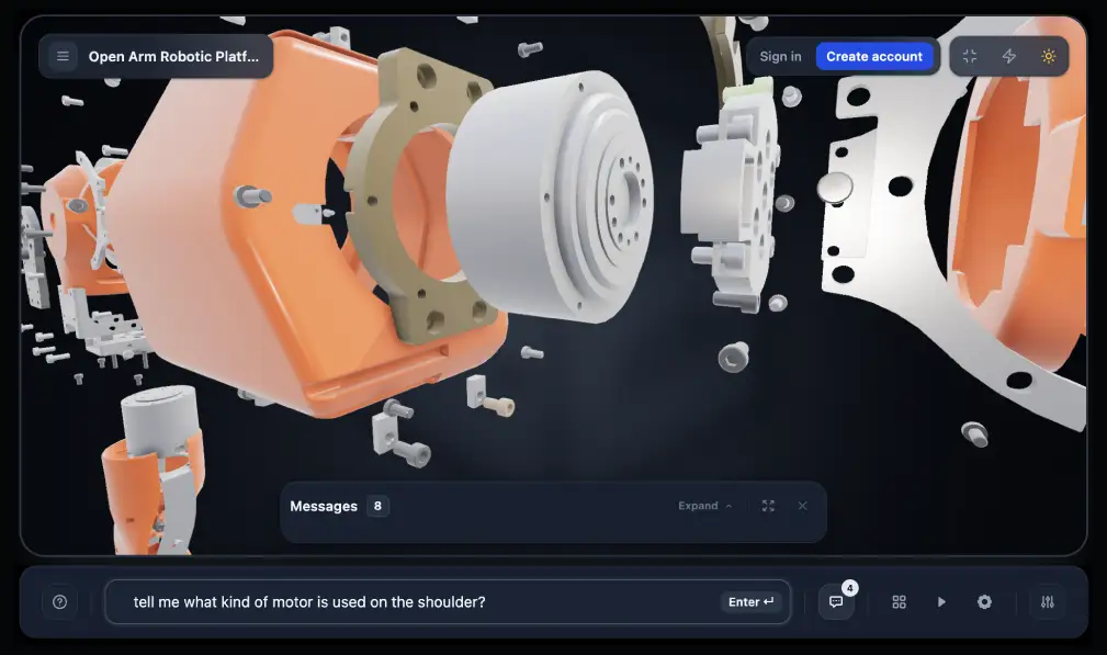
The viewer ships in two layouts. Which one a visitor gets depends on where they opened the scene, and the difference is not cosmetic — it changes how much of the screen the 3D gets and how much reading the interface asks for before anything happens.
Two layouts
Layout | Where it is the default | What it looks like |
Full sidebar | Scene pages, signed in or public | A resizable panel beside the 3D, holding the conversation and the tools |
Minimized strip | Embeds | A row of icons floating over the scene, each opening one surface at a time |
The minimized layout is the embed default because an embed usually sits inside a page the visitor came to for something else. A full sidebar in a short iframe leaves neither the model nor the conversation enough room, so the embed starts collapsed and expands on demand.
It is a layout difference, not a capability difference. The same agent, the same scene and the same actions are behind both.
The sidebar
Four panels, shown only when the audience is allowed to use them:
Panel | What it holds |
Chat | The conversation. Stays mounted while other panels are open, so switching away and back does not lose state |
Parts | The component browser for the assembly |
Tour | Guided tours authored for the scene |
Settings | Viewer preferences |
Panels a visitor cannot use are not rendered at all — nothing is displayed and then refused. A leaner configuration reads as a simpler product rather than a locked one, which matters most in embeds where the visitor never asked for a tour of your interface.
The Parts panel
The component browser lists everything in the assembly, with search and four filters:
Filter | Shows |
All | Every component in the scene |
Visible | Only what is currently on screen |
Hidden | What has been hidden, so it can be brought back |
Selected | The current selection |
Filters that would return nothing are disabled rather than shown empty. With no selection, Selected is greyed out.
Sidebar chrome
Dock and undock. The panel can sit against the edge or float over the scene.
Minimize. Collapses the sidebar to the icon strip described below — the embed default, available everywhere.
Resize. Drag the edge. Give the 3D more room for spatial questions, the conversation more room for reading.
The minimized strip
Collapsed, the interface is a row of icons over the scene. Each opens one surface, and only one at a time:
Icon | Opens |
Chat | The conversation, expanding over the scene |
Components | The parts browser |
Tour | Tour playback |
Settings | Viewer preferences |
Voice | Speech input, where the audience has it |
Help | The introduction to what the scene can do |
The strip reserves clearance at the bottom of the scene so an expanded surface never covers the part being discussed. When the agent isolates a component, the model stays framed in the space that is left rather than behind the panel.
Viewer controls
Separate from the sidebar, a control cluster sits over the 3D and governs how clicking behaves.
Control | Options | Default |
Selection mode | Off / Single / Multi | Single |
Camera focus | On / off | On |
Off makes the model non-interactive. Useful when the scene is decorative on the page and clicking should do nothing.
Single selects one component at a time. Clicking the selected part again clears it.
Multi accumulates a selection across clicks, for questions about a set of parts rather than one.
What each audience sees
Audience | Panels |
Signed in | Chat, Parts, Tour, Settings |
Public scene link | Chat, Parts, Tour |
Embed | Chat, Parts |
Tour generation, voice and conversation history follow the same rule as the panels: available where the audience has them, invisible where it does not.